Coronavirus Journalism: What They Put In, What They Leave Out
It’s been dismaying to me in following the COVID-19 outbreak closely that there are many misrepresentations of the data in the media and elsewhere, and those misrepresentations aren’t random: they always lean in the direction that makes the outbreak seem worse. The old journalism dictum “if it bleeds it leads” is in full force.
I’ve already commented extensively on the use of cumulative maps and charts — which always look worse even when the situation gets better (see “Why is Coronavirus Data Visualization So Bad” and “CoronaGeddon 2019: Why Every Map You've Seen of the Outbreak is Wrong”). Here’s an example from earlier in the outbreak of two graphs, both of the same data, with the one on the left more clearly showing the diminishing outbreak in China:

Showing the exact same data in two different ways. Both correct, but the one on the left makes it more clear that cases are going down (i.e. the outbreak is diminishing).
But this is only one example. The media, as well as many of those who want the media to pay attention to them, always pick the representation that makes things look worse.
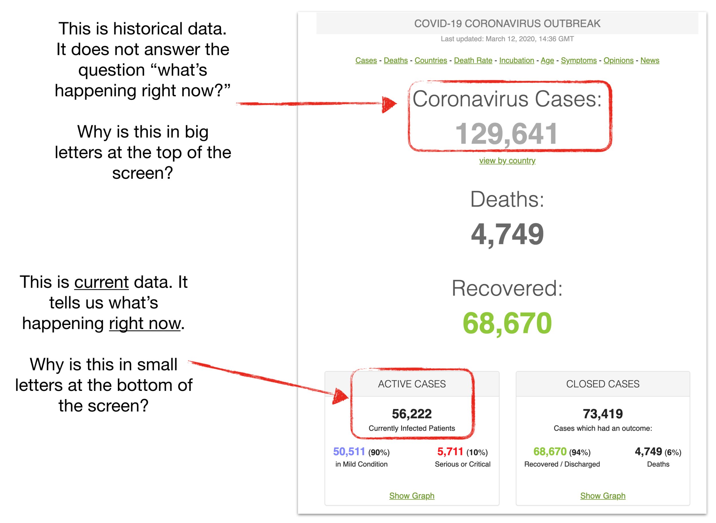
“Confirmed Cases” ≠ Current Cases
Example: Wall Street Journal
Every media outlet reports daily on the number of confirmed cases. For example, today the Wall Street Journal reported that:
Confirmed cases reached 121,061 Wednesday, in 115 countries and regions, data compiled by Johns Hopkins University showed. More than 4,360 people have died.
What’s the problem with the 121,061 number? The use of the present tense strongly suggests that as of now, we have 121,061 cases of COVID-19 on the planet.
But we do not have 120k cases of coronavirus on Earth today — because of course many, many people have recovered, and some have died. The total cumulative number of cases (121k) is a useful number to compare this outbreak with others, like SARS, but like other cumulative representations it never goes down — so it cannot be used to gauge the trend of the outbreak. For that we need to emphasize the current cases: people who are still sick (and taxing the healthcare system).
The New York Times does a much better job with this. Rather than just reporting a number, they make the number of current cases, deaths, and recoveries plain with a nice graph:
What that “121,000 cases” means, via NY Times
To make it perfectly clear, I might only add this note:
You might notice something else from the graph, by the way: the number of current cases is lower now than it was a month ago because of the dramatic decrease in new cases in China first, and now South Korea.
The Truth, The Whole Truth
Another example of “if it bleeds it leads” is also illustrated by that WSJ quote above:
Confirmed cases reached 121,061 Wednesday, in 115 countries and regions, data compiled by Johns Hopkins University showed. More than 4,360 people have died.
In addition to not making plain the difference between the ever-rising “confirmed cases” and the current cases, do you notice what the Journal leaves out?
Recoveries.
Why doesn’t the paragraph look like this:
Current COVID-19 cases totaled about 50,000 Wednesday, in 115 countries and regions, data compiled by Johns Hopkins University showed. Over the course of the outbreak, more than 4,360 of cases (4%) have died, and about 70,000 (55%) have recovered.
Those numbers are correct: 16 times as many people have recovered (thank heavens) than have died from this virus. But recoveries are rarely mentioned. Why not?
Example: Worldometers
It’s not just the Wall Street Journal, of course: the incentives to focus on cases and deaths, and ignore recoveries seems to be universal. We see the same thing at excellent data sites like Worldometers, which has really done a great job in general of showing us coronavirus numbers. But have a look at their homepage:
Example: New York Times
And the New York Times isn’t immune, either.
I looked at 200 articles appearing in the New York Times a couple days ago, on March 9th, to see how many mentioned total cases, how many mentioned deaths, and how many mentioned recoveries.
Of the 200, many were focused on the financial system, and didn’t mention anything about cases or medical issues. Of the 92 (46%) that did mention cases and/or deaths and/or recoveries:
In fact, the Times is almost 8 times more likely to mention coronavirus deaths than it is coronavirus recoveries (55/7), even though you are 15 times more likely to recover from the virus than to die from it (actually this is probably a dramatic underestimate if you are under the age of 70 and have no chronic medical problems or immunosuppression).
Let’s Keep the Public Informed of the Bad and the Good
COVID-19 is a major international epidemic, and has already killed more than 4000 people worldwide, not to mention causing untold economic damage. It’s a big, serious, problem.
In that light, it has actually been suggested to me that it’s better for media to focus on deaths to ensure that the country, and the world, takes this seriously.
It’s honestly hard for me to imagine the level of paternalism required to generate that perspective. The purpose of journalism is to inform, not to distort: to provide us the facts with which to make up our own minds. Let’s hope coverage of coronavirus moves closer to that ideal.
No journalism - from the most stylistically 'objective' to the most brazenly opinionated - has any real value unless it is grounded in facts, evidence, and verifiable data. — Glenn Greenwald