CoronaGeddon 2020: Why Every Map You've Seen of the Outbreak is Wrong
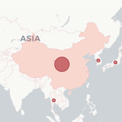
A week ago, I discussed the data visualization of the coronavirus outbreak which began in Wuhan, China. I pointed out the unfortunate over-reliance on maps, pointing out several flaws in the map-focused Johns Hopkins CSES coronavirus dashboard (below).
On further investigation, I discovered that the flaws in the maps we are viewing at the Hopkins site, and the NY Times, and the WHO, and many other locations are much, much worse than I understood at first.
Every map I’ve seen obscures the progression of the epidemic, rather than informing. Not just one map, but all of them. Let me explain how.
Epi curves show changes over time; most maps show "right now”
As I pointed out last week, the best method to track changes over time is a plain old column graph: an “epi curve” showing cases per day (optimally case per day of onset of symptoms), like this one at WHO’s dashboard.

The Blob: choice of scale and color for these circles exaggerates the problem instead of informing.
You will notice something important immediately: confirmed cases peaked on February 4, almost two weeks ago. This is completely invisible when looking at the Hopkins map.
This is because the Hopkins map only shows data from "right now”, rather than a daily progression of data. If you can only see one frame of the movie, you can’t very well understand the plot, can you?
This is the “chronicity problem.”
The Hopkins map has other issues, as well, including a hyperbolic color scheme that looks like it was pinched from a video game called “CoronaGeddon 2019”, and a choice of scale that leaves giant red circles covering 30% of the country — all of which suggests that the outbreak is more extensive than it actually is (when in reality only 0.002% of people in China have coronavirus).
But let’s focus on the chronicity problem.
Could animated maps make things better?
As I explained last week, I’m not against maps at all in general, and a good map can — obviously — emphasize the geographic element in an outbreak. The chronicity problem is a sticking point, however, so to really “track the outbreak”, you’d need a modern map that allows you to follow changes over time.
Theoretically, those animated maps would let you follow the progression similarly to glancing at the epi curve. And who knows, perhaps adding the geographic element would make them even superior to that plain old column-graph epi curve.
I managed to find a few of these online, from MapBox (a mapmaking software specialist), the London School of Hygiene and Tropical Medicine (an august school of public health and tropical medicine), and HealthMap (a rightly-famed mapping institution from Harvard and Boston Children’s). Here are animated gifs showing the data from January 20th to February 15th:
Via the London School of Hygiene and Tropical Medicine

Via MapBox

Via HealthMap/Harvard
Aside from the terrible color scheme of the MapBox map (worse even than Hopkins), do you notice something common to all of these maps? Take your time, watch any one of them all the way through until it cycles back to beginning.
Don’t see it? Each of these maps shows the outbreak as always getting worse — even though they are graphing the same WHO data as displayed above in the epi curve.
The epi curve shows that the daily new cases have been dropping for almost two weeks, and yet all three of these graphs do not show that. They show everything, always, getting worse. Every circle in the London School and HealthMapper maps always gets bigger, every color in the MapBox map always gets hotter.
What the heck is going on?
All the animated maps are mapping the wrong variable
At the beginning of this article I showed the epi curve from the WHO dashboard: a graph of daily new cases. But on the WHO dashboard there is another graph, as well: the cumulative graph of daily new cases. Let’s look at the two side by side:
Those two graphs are showing exactly the same data, but the cumulative graph keeps adding new cases to the total of old cases, so it never goes down.
Anyone looking at only the cumulative graph thinks things are getting worse (higher) every day, and could completely miss the nearly-two-week decrease in lab-confirmed cases (stats people reading this will realize that the decrease in new cases is reflected in the leveling out of the slope of the cumulative graph).
So all those animated graphs are graphing the never-decreasing cumulative numbers — leading any reasonable viewer to think we’re doomed — instead of the non-cumulative epi curve numbers.
And so are the non-animated maps
And after a bit more double-checking, I realized that all the non-animated maps suffer from the same problem: from WHO to the NY Times, all of the “track the outbreak” maps only track it cumulatively. Those maps always look worse from one day to the next, and they will until there are no more new cases. Which will likely be months.
I’ll be contacting each of these organizations to see if they can start using non-cumulative numbers instead. We’ll see how that goes. If they change them, the animated maps actually would be a useful way to view the progression of the outbreak.
Meanwhile, stop for a moment and think about how much needless alarm has been triggered by the ever-worsening maps.
Important Note: with the SARS epidemic (which was a related virus), the initial peak in China was later exceeded by the worldwide peak — likely because there were many more people in the world than in China who could possible get infected. Although we have no indication that that will happen with COVID-19, it’s certainly possible. By pointing out the decline in cases to date, I’m not saying “it’s all over” — but I know that IF it does peak again outside of China we’ll need to use the right visualizations to respond properly.
